I'm currently writing a guide to CSS, as a companion to my guide to JS. It's slow-going, but it's going. I realised along time ago that CSS is actually a difficult mess to use. Sure, it's pretty simple to wrap your heads around at the beginning, but then you try to make anything remotely more complicated than boxes of text next to boxes of text and, well, it's a while before fixing stupid layouting errors become second nature to me.
Anyway, after the previous image slice gallery thing, I decided to try another small CSS project thing. I tried making a slider where you can see one image, and then click an arrow to its left and right to see the next image. Got the idea from Fire Emblem Heroes's website, which use this system a lot.
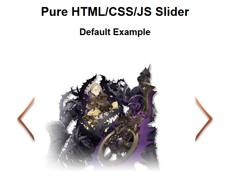
I realised VERY late that this is what most developers would call a "carousel". Screw it, I'm calling it an image slider.
In the spirit of hacking things together, I wrote all the code---the HTML and CSS and JS---in a single .html file. You can read the entire content of that file here. The code also contain some explanatory comments, so if you just want the quick and dirty overview, you can just read that.
This blog post is going to be a breakdown of what I coded and why I coded it that way. It's pretty basic as far as web programming go, but I'm not going to try to make it comprehensible for complete a beginner. You should, say, already know what flexboxes are (even if you aren't good at using it yet) and know about the arrow function in JS (even if you don't do a lot of scripting yet). It's also a bit more complicated than the image slice gallery in my other blog post, with a lot more JavaScript.
The Criteria
Before making this, I set up some guidelines on what I want it to be and what I don't want it to be.
I want the HTML to be simple and the single decider on what get shown on the screen. To add more image into the slider, one should simply add an element into the HTML without having to mess with the CSS or JS at all.
Style-wise, I want to keep it customizable. Changing the height or width, or border or colour or anything else, shouldn't disturb how the slider work. This means I have to keep the CSS as minimal as possible while still making sure it works. To make sure it can be used for mobile or desktop view, it shouldn't rely on the size of the screen.
The JavaScript should be a black box: no matter what kind of slider we're making, no matter what we put inside of it, as long as it's the correct syntax, we shouldn't have to modify the script at all. It should also work even when there's multiple slider in the same page, so it shouldn't rely on element's id. And, of course, it shouldn't have to use any external library; just plain JavaScript as supported by major browsers.
With that in mind, I get cracking.
What's in a slider?
There's a lot of ways you can implement a slider like this. This probably isn't even the most effective method.
Here's the HTML, for reference:
<div class="slider-container">

  <div class="arrow left">
    <img src="images/left.png"></div>
  <div class="arrow right">
    <img src="images/right.png"></div>

  <div class="slider-inner">
    <img src="images/character4.jpg">
    <img src="images/character2.jpg">
    <img src="images/character3.jpg">
    <img src="images/character5.jpg">
    <img src="images/character6.jpg">
  </div>
</div>
For this slider, I created a long flexbox containing all the images I want to show. I chose a flexbox instead of a plain block or a grid because I want to show multiple images in a horizontal row (difficult with a block) and there's an arbitrary number of them (difficult with a grid).
I named this flexbox "slider-inner". I then put it inside a container with its width set, the "slider-container". The container should be set to hide anything outside of its width (using overflow-x: hidden). When you're sliding to see the next image, you're literally sliding "slider-inner", you just can't see the image that's not on display.
This is what it looks like if you can see outside of the container: 
For this example, I set the container's width to 90% and its max-width to 800px. Think of it as: its width will be 800px, except when 800px is smaller than 90% of the width of the space allocated to it, in which case it'll just take up 90%. It's the basic tactic to creating responsive elements.
Each content inside of slider-inner should have its min-width set to 100%. That means 100% of the parent's element width, irrespective of overflowing. The "true" width of the parent element is much larger because the more content you add, the more it'll overflow.
Sliding "slider-inner" just means changing its left property. Because the width of a single content is 100%, setting the property to -100% will slide it a whole content to the left, which is just about enough to see the next content in the list. To be able to use the left property at all, I have to set position of slider-inner to relative.
Limiting Images
By default, images will always be shown in its original resolution. That's not something we want: we don't want it being bigger than the container it's supposed to stay in. So: set all images's max-width to 100%.
The Arrows
To be able to slide left or right, I'll need some arrows. The arrows are pretty simple: they're images inside of absolute positioned flexboxes. It's a flexbox instead of a plain block because I want to keep the arrow image in the vertical middle, easy with the flexbox-exclusive align-items: center. The image for the arrow can also be replaced with plain text or iconfonts, no problem.
Set slider-container's position to relative, so arrow's positioning will be relative to it instead of to the screen. Set the left arrow's position with left and the right arrow's position with right and we're done.
I also have to add z-index and set it to a high number. This way the arrow won't be hidden behind the images in the slider.
Transition
So we'll actually see the slider sliding when it's sliding, we'll have to set its transition. I just grabbed something from easings.net and plopped it into slider-inner: transition: left 1s cubic-bezier(0.445, 0.05, 0.55, 0.95).
There's also a utility class, "noanim" that just disable transitions. We're gonna need that later.
Showing More than One Image at a Time
By default, the slider shows one image at a time, but it doesn't always have to be so. Instead of having slider-inner containing images, you can also have it contain either flexboxes or grid, and each of those can have as many images as you need. In this way, you can show more than one image at any given slider position.

The HTML for the grid one looks like this:
<div class="slider-inner" style="left:0;">
    <div style="display:grid;grid-template-columns:repeat(3,1fr);">
        <img src="images/character4.jpg">
        <img src="images/character2.jpg">
        <img src="images/character3.jpg">
    </div>
    <div style="display:grid;grid-template-columns:repeat(2,1fr);">
        <img src="images/character5.jpg">
        <img src="images/character1.jpg">
    </div>
</div>
You can style it in any way you like. The one caveat is that, if you use a flexbox, and one box has longer width (i.e. because it contains more images) than the others, it'll bleed to the next. I have no idea why this is. I'd suggest using grid if each box will have variable width.
The Complete CSS
Here's the entire thing.
.slider-container {
    /* Positioning the slider.
    Feel free to change! */
    width: 90%;
    max-width: 800px;
    margin: 10px auto;

    /* Don't change these */
    position: relative;
    overflow-x: hidden;
}

.arrow {
    /* Don't change these */
    position: absolute;
    display: flex;
    align-items: center;
    height: 100%;
    z-index: 10;
    /* But you can change this one */
    cursor: pointer;
}

.arrow.left {
    /* Positioning the arrow.
     Feel free to change! */
    left: 10px;
}

.arrow.right {
    /* Positioning the arrow.
     Feel free to change! */
    right: 10px;
}

.slider-inner {
    /* Don't change these */
    display: flex;
    position: relative;
    left: 0;

    /* Feel free to change these! */
    align-items: center;
    transition: left 1s cubic-bezier(0.445, 0.05, 0.55, 0.95);
}

.slider-inner > * {
    /* Don't change this */
    min-width: 100%;

    /* To keep it looking neat, don't change these */
    margin: 0;
    box-sizing: border-box;
}

.slider-container img {
    /* These will keep image's size proportional and make sure it doesn't bleed outside the box. */
    max-width: 100%;
    object-fit: contain;
}

.noanim {
    transition: none;
}
With that out of the way, we just need to deal with the JavaScript for when the arrows are clicked and the slider is sliding.
The Script
One of the criteria is that it should work no matter how many sliders we put inside a page, so we shouldn't make any global variables or use functions that point to specific elements.
To do that, I use querySelectorAll to select every instance of "slider-container", then iterate through all of them using forEach(), and just create all my variables and run all the scripts in there. This way, each slider will then have its own set of variables and functions that only apply to itself, without bothering any other element.
Here's the entire script, before I go over them:
window.onload = () => {
    // Slider code
    // Apply to all slider in the page
    document.querySelectorAll('.slider-container').forEach( (slider) => {

        // Utility querier
        let q = (selector) => {
            return slider.querySelector(selector)
        }

        // Get current image id from dataset
        // default to 0 if it's not set
        if (!slider.dataset.currentImage) {
            slider.dataset.currentImage = 0
        }
        let currentImageId = parseInt(slider.dataset.currentImage)

        let rightArrow = q('.arrow.right')
        let leftArrow = q('.arrow.left')

        let sliderInner = q('.slider-inner')
        let maxImageId = sliderInner.children.length - 1
        // We use "image" but the children of the slider can be also be a flexbox or grid

        // Toggle animation in the slider grid
        let toggleAnimation = () => {
            sliderInner.classList.toggle('noanim')
        }

        // Switch which image is being shown
        let changePos = (imageId) => {
            let percentage = imageId * 100

            sliderInner.style.left = -percentage.toString() + "%"

            slider.dataset.currentImage = currentImageId.toString()
        }

        // Make the left/rightmost arrow invisible when left/rightmost image is shown
        let updateArrowVisibility = () => {
            if (currentImageId == maxImageId) {
                rightArrow.style.visibility = "hidden"
            }
            else {
                rightArrow.style.visibility = "visible"
            }
            if (currentImageId == 0) {
                leftArrow.style.visibility = "hidden"
            }
            else {
                leftArrow.style.visibility = "visible"
            }
        }

        rightArrow.onclick = () => {
            currentImageId += 1

            // No change if it's the rightmost image
            if (currentImageId > maxImageId) {
                currentImageId = maxImageId
            }
            else {
                changePos(currentImageId)
                updateArrowVisibility()
            }

        }

        leftArrow.onclick = () => {
            currentImageId -= 1

            // No change if it's the leftmost image
            if (currentImageId < 0) {
                currentImageId = 0
            }
            else {
                changePos(currentImageId)
                updateArrowVisibility()
            }
        }

        // Set initial image shown
        // Turn off animation just for this initial setup
        updateArrowVisibility()
        toggleAnimation()
        changePos(currentImageId)
        setTimeout(toggleAnimation, 10)

    })
}
First I made a small utility function, q() with the sole purpose of not having to write slider.querySelector() again, because screw that.
After that we set up all the variables that we need: currentImageId is the current image being shown, with 0 being the leftmost image; rightArrow and leftArrow being the arrows, duh; sliderInner being "slider-inner"; maxImageId is the id of the rightmost image, which is equal to the number of content (children of slider-inner) minus 1 (because the id begins at 0).
toggleAnimation() just applies the "noanim" class when it's not applied, or remove it when it's already applied. We'll need that for later.
changePos() is the function that actually slides the slider. It takes the imageId as an argument, multiply it by 100%, and then set that to slider-inner's left property. Remember how the leftmost image has the id 0? When imageId 0, it's at rest, showing the first image. When it's 1, it's slid a full image to the left, to show the second image. When it's 2, it's slid two full images to the left. And on and on.
When the image being shown is the leftmost one, we don't want the left arrow to exist because there's nothing to slide to the left to. We want the same thing for the right arrow when we're already at the rightmost image. updateArrowVisibility() is the function that sets the arrows' visibility.
The last functions we need are those when the arrows are clicked. It's pretty simple: if the left arrow is clicked, reduce currentImageId. If the right arrow is clicked, add to currentImageId. When we've hit the edge but the arrow is somehow still clicked, it shouldn't do anything.
That should be all that we need, but I also add a way to change the the first image being shown right through the HTML (remember, we want the JS to be a black box).
Changing the First Image
We can decide what image get shown first when the page is loaded by setting the slider's data-current-image attribute. When setting currentImageId in the script, it'll first see if this attribute is set, only setting it to the default 0 if it isn't.
Data attribute is always a string, so when reading from it I have to change it into an int first.
if (!slider.dataset.currentImage) {
  slider.dataset.currentImage = 0
}
let currentImageId = parseInt(slider.dataset.currentImage)
There should probably be some error-checking here in case data-current-image is not set to a valid iamge id (i.e. not a number, negative number, more than maximum), but I haven't gotten around to adding it yet.
With all the variables and functions set, the last thing we need to do is making sure that the slider is set to show that first image upon loading. I did that using the final bit in the script:
toggleAnimation()
changePos(currentImageId)
setTimeout(toggleAnimation, 10)
By turning animation off using toggleAnimation(), the slider will slide to the right image immediately, instead of showing a distracting animation on page load. But despite the fact that it looks instanteous, it's not, in fact, instant. If we don't use setTimeout when turning the animation on again afterwards, the animation will be turned on before the slider is slid.
Embedding it into the Rest of Your Script
Whenever the image being shown on the slider changes, it'll update its data-current-image attribute into the id of what image is currently being shown. This attribute can be taken and used into other parts of the script.
I had thought that was enough.
I only realised after writing this entire long-ass blog post that it's probably a better practice to create an object out of all the slider-container element, with its various variables as its properties and the functions as its method. This way you can call changePos() or updateArrowVisibility() at will, instead of only when the arrow buttons are clicked.
I am a fool.
But hey! It works! Good enough for me!
This blog post ends up being huge, but thanks for reading!
Credits
The images I use for this sample came from the mobile game SinoAlice. They're nice art, ok.