In this post I explained the process behind the creation of Lightning Cards, a small flash card app I made. Check the app out!
Flash cards for me is an indispensable tool when learning a new language. Put a foreign word in one side, put its equivalent in a language I know in one side, do this ten times then shuffle them, and boom, instant vocabulary practice. A lot of modern language-learning apps use this flash card approach in their system, with Duolingo being probably the most prominent among them. It's a good approach, and pretty effective at drilling those words into your head.
But the thing with Duolingo and other language-learning apps is that they're usually tailored to a specific vocabulary and curriculum that you can't really change. The built-in curriculum is convenient, but there are times when it just doesn't suit what I really want. Sometimes I just want to drill some specific words I have trouble with. Sometimes I want to drill in something completely unrelated.
Anki, which is the flash card app, sounds like it's a good solution seeing as it has robust customizable cards. But I think it's unnecessarily complicated. Making new cards is a huge pain, and making a large number of them is just time consuming.
So I thought, "huh, I know a bit about web programming. Maybe I can just make my own app. It'll take like, a couple of hours, tops."
I was a sweet summer child.
It took about three weeks (minus a couple of days when I can't work on it), but I did it.
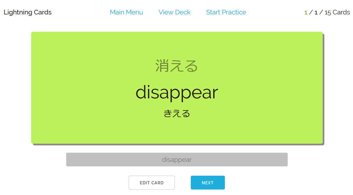
Lightning Cards is almost exactly the flash card app I've been wanting (it better be. I spent three-ish weeks making it). It's nice and simple, it loads quickly, and you can easily make your own cards. During practice sessions you'll be shown either the "front" or the "back" of the card, you type in what you think the other side contains, and it'll tell you if you get it right or wrong. Press Enter, move on to the next card. Once you've exhausted all the cards, they'll tell you how many cards you got right.
No frills. Simple. But boy, even this kind of simplicity requires some efforts in the back, huh?
This post is where I talk about the process of creating it. I divided this post into three parts: The Coding Nonsense, Designing the UI, and Managing a Solo Project. Those are the three things that I learned from wasting my time on this thing. Feel free to jump to whatever headline you like best.
The Coding Nonsense
I spent 4 months being an intern working on front-end web development. I learned a lot there, so I'm already used to the messy messy world of JavaScript development. That's like months of pain already heaved away.
I decided to use the JavaScript framework Riot to build it, instead of rolling with React (too heavy, complicated to set up), Vue (haven't gotten enough experience with it, don't want to bother learning yet), jQuery (not really what I needed), or vanilla JavaScript (you're kidding, it'll be way too much work). Riot is a wonderful little thing: it's smol, its syntax is pleasant and doesn't deviate too much from the vanilla, its documentation is just one well-written page and not a lot of else.
As it turns out, Riot is a great pick because it makes no assumptions about how I structure my app and data, letting me do things that would require another couple of days of reading documentations had I used something more robust. Buut I did have a bit of problems because of how it mounts its element. I'd still use Riot for apps of this size, but for anything more complicated I think I'll go use Vue/React.
On my previous forays with Riot, I just uses the in-browser compiler, but for this project I decided to pre-compile it with Browserify + Watchify. Most JS developers use webpack, but screw that. I have bad memories of dealing with that configurations nightmare. Browserify (plus its riot plugin) just compile then combine everything into one file that you can just . Simple. No config files. No further bullshit.
(I probably will have to add some bullshits of my own though, if I want to add a CSS preprocessors and such, but at least they're my bullshit)
I use Atom as my text editor. The Riot syntax plugin is a bit rough around the edges, but it doesn't trouble me too much. I use my usual browser, Firefox, for testing etc. In defiance of classic web dev methods, I just have Firefox open the base HTML file, no bullshit with making local servers. Watchify already automatically compile my source code to the base JS file that's attached to the HTML (and it does it really quickly too. Props to the folks who made it!). Now whenever I want to see new changes, I'll just Alt-Tab to the browser and reload.
So whenever I want to get to work, I'll just open Firefox, Atom, and Command Prompt. While Atom loads (Atom's initial load is slow but I've made peace with it), I'll direct the Command Prompt to my work directory and type npm start, which I've already wired to Browserify + Watchify. I'll then have Firefox opens the same base HTML file. Quick and easy.
Did I mention I work on Windows? I know Linux is preferred for development or whatnot, but working on Windows is really no trouble at all.
Unlike most of my previous coding projects, where I just type whatever that works to hell with readability, I tried my hardest to keep my codes neat and structured. I tried using a clear consistent naming scheme, and commenting when the codes/names get complicated. The goal is so that even if I dropped it and only picked it up years later, I can still look at it and know what's going on.
I'm not sure if I succeeded here, but I think I did okay. There were moments when I have to go back and rename a lot of variables because my own terminologies change, or when I have to restructure a component entirely to play nice with the components I made later. I doodled some of the app's structure on literal paper before I started coding, but I'm the kind of person who doesn't know what I'm building until I'm actually building it so not a lot of that is helpful. It's a bit time consuming, but hey, we don't argue with who we are, we work with them.
As it ends up, my app resembles a front-end / back-end system despite being 100% HTML/CSS/JS running on your browser. The "back-end" is a JS object I call Deck, which is created whenever the thing loads. It contains cards and sessions, along with all the methods to modify them. Cards are objects made from the class Card, which contains methods to modify itself.
Creating Card is a method built into Deck, so I just have to export that one Deck object and give it as a prop to all my Riot components. Everything the app does---creating new cards, switching decks, etc---are just methods call to that object. Riot mostly only handles how they're shown.
For saving/exporting decks, I make an object containing the name of the deck and the array of Cards and just straight-up JSON.stringify() it. Stringify strips all objects of their methods for obvious reasons, so when reloading/importing them, I just have the Deck object create new Card object for each card.
Decks are saved locally using LocalStorage, which is wildly easy to use. It's nuts. I thought I was gonna have to mess with cookies or whatnot, but noo, it's literally just localStorage.setItem() and localStorage.getItem().
There are of course, a whole lot of improvements I can add, even before considering all the features I haven't implemented. Error-checking, for one thing, which this app has zero of. I never considered how things can go wrong, if a component get some bad data, etc. I just truuust that JavaScript's light stance towards unforeseen circumstances will see me through. More experienced programmers will probably yell at me for literally everything I do, I know.
But overall, I'm really glad of how this thing shapes up, code-wise. It's clean. It's small and lite enough that it'll blaze through most browsers. It only took me three weeks (and not even every day of those three weeks), when it could have taken a lot longer. And it works, even on mobile. Honestly this is the first time I'm soloing a coding project that takes more than two days to finish, so I'm pretty happy with the result.
Designing the User Interface
I'm a snob when it comes to designing user interfaces! I love UI design! Playing a video game, one of the things that can make it a transcendent experience for me is always the UI. Bad, cumbersome, slow UI can make make me go noooope and punt a perfectly usable tool out of my sight.
I am also garbage at designing anything remotely graphical, which makes my web development hobby kind of difficult, eh?
For Lightning Cards I aimed to make it as simple and clean as possible so 1) I don't have to think about too many design elements, 2) It shouldn't get in the way of your cards. Most of the current design I built up from the CSS framework Skeleton, which already looks pretty nice for a minimalist sort of site..
The first thing I designed was the cards in practice mode for desktop.
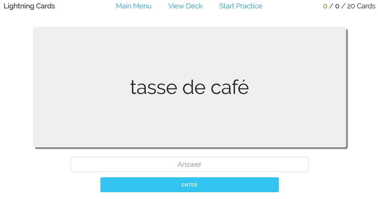
To make the card look like card, I gave it rounded edges and simple box shadow. I thought about making the box shadow ala Material Design at first, but screw it, that's just gonna make it more complicated. I gave the card an 80% width, so it'll always encompass a decent chunk of the page. The height is set to a fixed 300px, which gave me trouble when I tried it on mobile. The on-screen keyboard eats up a lot of space, apparently, so I reduce the mobile height to 120px. Both these numbers I plucked out of nowhere, but it looks good, eh?
The next thing is how the card would look after you answered it. In lieu of telling you whether you get it right or wrong with words, I opt to just show it with colours: green if you got it correct, red if you didn't. It's simpler and quicker to understand, but truthfully, I'm just doing this so I don't have to add one more element that say "Correct!/Wrong!". Adding a CSS class is way easier.
I'm not entirely sure if this is gonna be a hindrance to colour-blind people. If you have any insight into that, let me know!
Another point of consideration is how I should display the "back" of the card, the part that the user is guessing. I figured it wouldn't make sense to give it the same handicap as a physical card, so it'll show both the words in the "front" and the "back", along with synonyms for the back so you can check it with the answer you typed in.
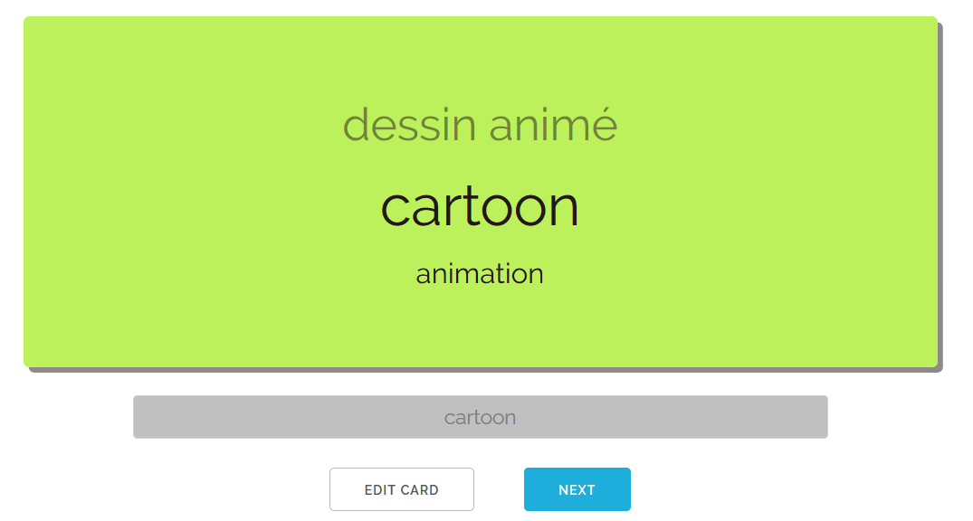
In the early build, the input box is hidden once you've submitted it. My first beta tester (love ya sis <3) told me it's annoying she couldn't know where she got it wrong if her answer was marked incorrect. Funny how I didn't think of that.
Being able to edit card mid-practice was mostly inspired by Torii SRS. I use the synonym system a lot, adding a synonym that just came to me while practising. This then leads to me designing the card edit view.
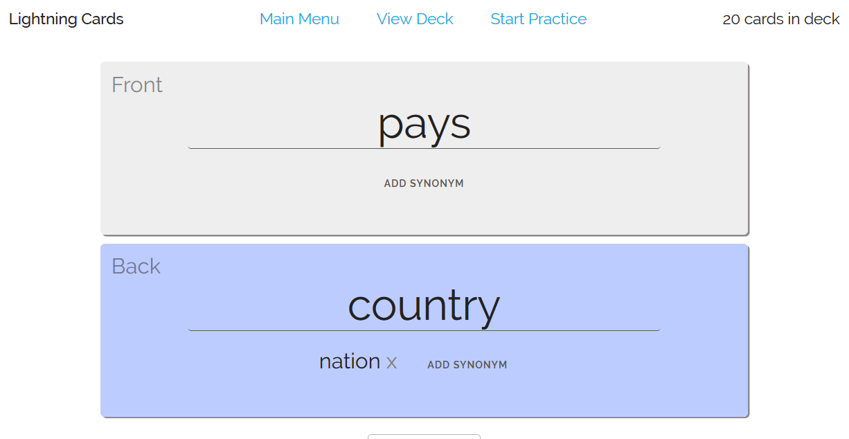
For one second I considered making the front and the back separate pages that you can switch about with some fancy card-flipping animation. Nope nope nope. Too much work. This is way simpler and also easier to use.
In the original version, the words are just uneditable text. When clicked, it'll transform to a textbox that users can type into. But I couldn't find a way to make it obvious that you're supposed to click on it. In the end I just make it a textbox by default, which I hope is obvious from the lines underneath and the typing cursor.
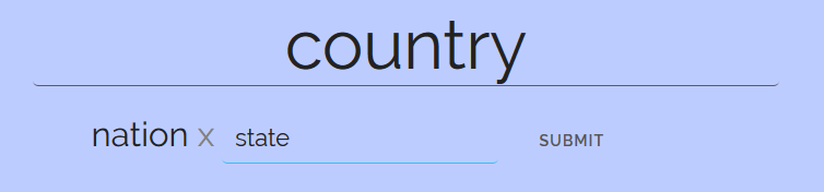
The synonyms is straightforward: x will remove it, "add synonym" will open a small textbox that you can type in. Unlike the regular textbox, which is always automatically saved whether or not you clicked Enter", you'll then have to submit this either by pressing Enter or clicking the Submit button. I hope it's obvious with the button being there.
Next I designed the page where you can see all your cards.
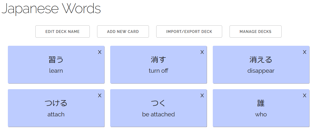
I had a couple of options here: show a simple list? A table? At the end I just stick with these small cards that show the words in both "sides". It's a bit more space-consuming that a list/table, but it's also more pleasant to navigate. It might be a bit overwhelming if the deck has a lot of cards, but since the app is designed for people who make their own cards (instead of preloading a 1000+ words deck), I think they'll be able to handle the cards they make themselves.
I'm thinking of adding some navigation system (search? filter?), but I haven't met anyone who'd make use of it yet.
CSS-wise, the container is a flexbox. This ensures that no cards will be cut-off in smaller screens (e.g. mobile), while also be large enough to be recognizable as cards. In smaller screens, it'll show one/two cards in a row instead of three.
Cards can be removed by clicking on the x button, which will also make the small card looks red when hovered.

I didn't actually consider this at first; I was just going to have a "Remove Card" button in the edit screen. But, yeah, this is way nicer. I like it. I'll stick with it.
In the main menu, you can change the practice setting by simple picking from the dropdown.
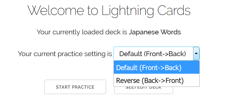
This is also inspired by Torii SRS. I was considering making a whole new Setting page at first, but thought it was too much trouble. This is simpler, to-the-point, and easy enough to understand. "Front->Back"/"Back->Front" might be a bit mystifying, but I can't think of any other way to describe it that would be short enough for the dropdown. In any case, that the setting means should be clear once you use it.
The header I made early on simply because I thought "Well, it gotta need a header, right?"

The card counter to its right is I think a must-have. The green number shows you how many cards you guessed correctly, while the middle one shows you how many you've done. At first I think I was gong to make the middle one show many you got wrong and color it red, but thought it'll just be extra confusing. This is admitedly not much better, but it should be clear once you actually use the app.
I didn't mean to make the the links in the middle of the header at first, but soon realised during my own testing that, yeah mate, I really need it actually. I just slapped the links onto the header, and flexbox position it nicely. Thank you, flexbox.
I hid the links in mobile view since mobile isn't wide enough to contain the entire header. Instead, clicking the "Lightning Cards" name should take you to the main menu, which contain links to go to the other screens. There's, like, zero indication of this, but I think most internet users have figured that clicking on the site's logo will take you to the home screen. My beta tester just understood it intuitively, so hopefully other people will too.
Managing a Solo Project
When the idea first came to my head, I naively thought that "it'll take a couple of hours". I managed to throw that assumption into the dustbin as soon as I started coding.
That's a good thing. I have generally low energy to do things, but I also have (undiagnosed) attention span issues. A project that promises to "not take long" can cause me to dangerously hyperfixate on it. Once I realised the scope of the project, I started to pace myself. I threw away some features from the to-do list. I started slowly, wrote down what I have to do, kept a clear goal of what I wanted. I acknowledged that this was going to take some time, and I let myself work with that.
This is a solo project with absolutely no external incentives, but I liked to think of it as a practice for more rofessional projects. I tried to treat it like a full-time job: at least six hours a day, and I'm not allowed to work on it outside of "work hours". I'm on summer break at the moment, so I can afford to think of it like that. Family issues made it so I can't really do this every day, but when I can, I did. (God I wonder what my parents think, me holing up with my computer all the time).
I started with the visual of the core practice sessions, which is odd since I'm not very visually-minded. I guess out of all the madness of front-end development, the one I'm most familiar with is basic HTML/CSS. Start with what you're familiar with, I suppose. Fortunately, the Riot framework absolutely supports this. The way it's designed mean I can easily insert the script later.
That early look then led me to make the "back-end" of the cards as I explained in the above sections. The first thing I did after that back-end was seeing if exporting/importing even works. So the Import/Export page is actually one of the earliest page I made. If that didn't work, I would have torn the whole thing down and rethought the entire thing.
Everything else then just grew out of that. When I needed to stop working halfway through a component, I wrote a quick //TODO: in the code, explaining what I still need to get done. The To-Do list became indespensible; I would otherwise be paralyzed with indecision of what I'm supposed to work on next.
So a solo project means it's mainly: 1) Having a To-Do List, 2) Pacing myself, 3) Bumbling along. Going solo means you can work the way you want to, that you don't have to adjust your process for other people, but there's no sense in confusing things to your future self. Write down notes. Keep a clear breadcumbs of your ideas.
End Notes
Am I glad for having wasted a lot of time working on that thing? Boy, I have no idea. It sure is a nice, shiny thing in my portfolio, for whenever I decide to take a full-time job in web development. No one (that I know of!) is using the tool though, so in a way I guess it's just a colossal waste of time.
(Even I don't end up using it a lot, but that's just because I'm neglecting my language studies).
But I feel like I've learned a lot of things in the process of making it. It's not really something I can take pride in, or to show to other people to prove that I'm not a waste of space. But in the end, I think I'm glad I've spent the time to make it.